The pitfalls of provocative advertisement

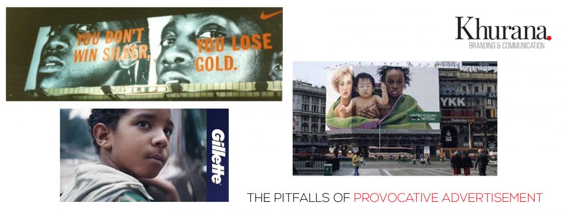
Just before the 1996 Atlanta Olympics, #Nike released its ‘You don’t win Silver, you lose Gold” campaign. On the face of it, it communication, it comes across as a very straight communication, but when the full meaning sinks in, the problem begins.

There was an instant backlash against this campaign on the grounds that it went against the basic principles of sports and more importantly, Olympics. “Does it mean that anyone who does not win a gold medal is a loser?” was the question asked. #Nike had no choice but to withdraw the campaign.

Recently, in order to lend its support to the #MeToo movement, #Gillette released its ‘Is this the best men can get?’ campaign. This was a slight variation on the original Gillette punch-line ‘The best a man can get?’

Observers felt the ad portrayed men as the culprit, when the intended meaning was to set an example for the younger generation. The visuals failed to establish this aspect. Gillette wisely gave a quiet burial to the campaign, but the controversy kept simmering for a while.

In 2000, #Benetton that must have had the longest record in provocative advertisement rolled out its campaign against Death Penalty ‘Looking Death in the Face” it stirred a hornet’s nest. Thereafter, almost every #Benetton campaign has faced stiff opposition. The  Death Penalty campaign had the victims’ families were up in arms but #Benetton held its ground.

All these incidents show that while provocative advertisement does grab you eyeballs, how you handle sentiments is equally important and thus is an area where brands need to tread cautiously. Following points need careful examination:

  • Does you brand have a history: For a brand like #Benetton, controversy is nothing new. Almost every campaign has landed it in a soup. Infact, #Benetton has carefully cultivated this image. Are you sure, you want to take that route?
  • Will it help the brand and sale: For a brand like #Gillette, while the intention was right, the execution was not. Post release, there was a sever backlash against the campaign with men refusing to buy Gillette, any more.
  • What is the cause you are upholding: While winning gold is the ultimate dream of every athlete, winning silver does not make anyone smaller. Infact reaching the Olympics is in itself a big deal and the #Nike campaign missed that message thereby eventually forcing it to withdraw the campaign from the market.

While it is a fact that #ProvocativeAdvertisement is often an effective way of generating instant attention and interest, at Khurana Brand and Communication we suggest brands be careful about taking that route. It’s a beast that once let out of the cage, may be difficult to tame later.

Why DIY collaterals don’t work?

When was the last time you saw a physical copy of the Yellow Pages?

Is print dead? Not quite. But it’s definitely taken a new avatar in the digital era. We have moved into a world where your business is known from your Facebook page and your website than from your physical presence.

In such a world, your content marketing strategy must be razor strong to draw-in customers at every digital touch point. These marketing collaterals could be brochures, leaflets, packaging, banners, TVC, Radio Jingles, POP & POS material in the physical world, FB /Linked In pages, twitter accounts, websites, micro-sites, Videos, GIFs, interactive games etc. webinars etc.

Have you heard of #Canva? A very popular a graphic-design tool website, founded in 2012, you can use Canva‘s drag-and-drop feature and layouts to design, share and print business cards, logos, presentations, anything. It is used by a host of novices as well as professional designers for web and print.

Likewise, you can use #Wix or #Mobirise to create a beautiful website for your business by using their custom themes all for a song. Indeed, the internet is flooded with DIY tutorials and templates to get you rolling but the big question here is – should you?

Should you make your own marketing collaterals or go to experts?

We would suggest that when it comes to business, don’t follow the trial and error method. You may save on the agency cost but if the work comes across as amateurish.

Why D-I-Y (Do it Yourself) Doesn’t Work?

There are some inherent advantages that outsourcing to experts offers over DIY:

  • Access to experts: Every individual have their own strengths. Strategy and creative thinking makes brands. An agency would have a pool of experts adept at communicating your brand. A brand may lose expert insights if it decides to go the DIY way.
  • Access to the latest: Unlike a brand executive, an external agency would have better connect with the latest in the advertising because that is his/her primary job.
  • Lowers the cost of marketing: By taking the expert route, a brand pays only for the services consumed. It’s easy to trim excess capacity whenever required. This is not possible with the DIY route as you cannot trim internal staff so easily.
  • Focus on core competencies: Outsourcing allows brands to focus on strategy, the direct outcome of the DIY way is weak or not so robust a strategy.

So, while the internet is undoubtedly flooded with DIY tools, established and experienced agencies like Khurana Brand and Communication are much suited when it comes to creating strong brands. Don’t be a pill-popper. Do to the doctor for that malady.


Why should your brochure be slim, and website fat?

Most readers reading this post will have both collaterals to engage with their customers. While both are very effective consumer touchpoints, there are certain intrinsic differences in the use of these tools.

Ever wondered why brands which use these tools for communicating with their customers make a brochure slim while the website fat? Let’s figure out.

Push Vs. Pull 

While the world is going digital, the basic marketing principles won’t change, although the tools might. Consider the example of a mutual fund company like #HDFC Mutual Fund or #Reliance Mutual Fund that are heavily dependent on advisors to further their business. A brochure is a perfect give away. Sitting on the customer’s desk, the possibility that he/she might call back increases manifold. The same works for a salesperson going on client visits. In case of a website, the traffic is pulled from various sources with the help of search engines. There is no direct one-on-one.

Interaction time

Unlike a website, a brochure offers the opportunity to prolong the interaction time. The lesser (but pertinent and relevant) information carried in the brochure, the higher the opportunity for the salesperson to engage. However, in case of a website, there is rarely any one-to-one interaction and hence the website can carry unlimited information related to a brand, product or a company. A web user is flirtatious, he will flit from site to site. But the brochure because of its physicality offers bonus engagement time to the brand.

Silent speaker

A smartly-designed brochure is a silent speaker for the brand even when it is just lying on the customer’s desk. But obviously, because of the print cost involved, it cannot be as big as an encyclopedia. However, a website can be like an encyclopedia as the customer is at liberty to dig deeper into the site to know the brand better. A website, in that sense is the ultimate repository of all information on the brand.

Trailer vs Film

Think of a brochure as a film’s trailer. It will be showing stuff that will entice the viewer to watch the entire movie. Hence a brochure has to carry just the stuff that will appeal to the customer and intrigue him enough to want to check out the website, eventually.

The cost factor

While this may not be your primary concern, so long as the RoI is promising, the cost of a brochure is much higher than a website. Hence, the brochure cannot exceed a particular size and hence it has to be very slim. Its shelf life is also longer, while website content can be overhauled anytime and is relatively an inexpensive process if you have CMS.

Ask any big company like #L&T or #GE. Even today they rely on their sales teams for lead generation. They will always rank a brochure higher than a website when it comes to pitching a new product to any customer. While they will definitely want a detailed website, they will still prefer being armed with a slim brochure first!

What comes first, content or design in brochure planning?

Although humanity has failed to find an answer to the mother-of-all questions “What came first – chicken or egg?” we decided to pose another difficult one “In brochure design – what comes first, content or design?”

Let’s attempt an answer systematically:

The design-first approach

  • Have you been checking out the marketing collateral from #Apple’s stable? Historically, #Apple or its arch-rival #Samsung follow a very minimalistic design strategy.
  • With both brands, the hero is the product. While even the hero may change, once too often, what remains constant is their minimalistic design and one terrific punch line to support the visual.
  • #Nike is another case in point. The design is always alluring and purposefully meant to get customers to ‘#Just do it.” The copy is also short, crisp and to the point.

Content-first approach

  • For service providers, the requirement is different than product companies. Let’s consider of the #Taj Group of Hotels. Unlike product companies, they rely more on content to convey their message. Here content gets an upper hand over design.
  • Also, given the fact that a brochure allows longer interaction time to flip through the details, service companies do not want to miss any opportunity to impress the customer, hence focus primarily on the content to get their message across.
  • Horizontal classifieds platform (online marketplaces) like #Amazon and #Flipkart want to project themselves as a one-stop-destination for all your needs. Their collaterals are deigned to give an idea of the awesome ‘range’ and the multiple categories of products on display, than showcase the attributes of a single product category. Therefore, there is more width than depth to their visualisations in terms of both design and copy.
  • #Uber, the cab hailing service is another service brand with no real assets. The assets are owned by the drivers. So they do not want the cab to divert your attention. For them content is the king to creates a brand connect with a mention of keywords, such as #Ubercomfort and #Uberconvenience.

This brings us back to the start. What must come first – content or design?

At Khurana Brand & Communication, we believe that the correct answer lies somewhere in the middle. If for companies like #Apple, #Samsung and #Nike, design does all the talking; in case of service brands like the #Taj Hotels, #Uber, #Amazon or #Flipkart, the content becomes the design in order to create the right perception.

Brands cannot survive by eliminating one and relying fully on the other. This would be suicidal. However by overplaying or underplaying an element, the final impact can be strategically maximised. Which element needs to be underplayed will however depend on the brand philosophy.

Top Design Trends for 2019

It’s that time of the year, when design houses make predictions to set the tone for the whole year. We are doing our bit, so let’s roll

We at Khurana Branding & Communication believe that the year 2019 will be a year of contradictions in Design. It will witness a confluence of the past and the future. Mark our words it will be very different than what we witnessed in 2018. We strongly feel that it will be a mix of one or more of the following trends in the year to come:

  1. Arrival of 3D: The trend of 3D design started gathering steam towards the later part of 2018 and will reach its full potential in 2019. Be it in logos, fonts or graphics 3D has arrived and here to stay.
  2. Isometric designs will sell like hot cakes: Creating a 3D effect is a difficult proposition, though a beautiful one. Hence the next best thing to 3D, Isometric designs help in creating the same effect. It will not only be faster to create, it can communicate a whole story in just one glance.
  3. Asymmetric is in: Till now, things were pretty much simple. They were very symmetrical because human eye loves symmetry. But 2019 will be a year of Asymmetry. Since asymmetry conveys the kinetic energy better than symmetry, it will be used greatly in various communication tools.
  4. Duotones and gradients: Till now single color of multi colored logos and design elements have ruled with ease. But their monopoly will be threatened by the use of duotones and gradients. They will start to dominate logos, font colours, pictures, backgrounds, animations and all possible design elements.
  5. Strong return of warm colours: While Duotone and gradients will rule the roost; they will start witnessing a strong resurgence of warm colours. Don’t be surprised if duotones or gradients in warm colours start giving a tough time to the pallet of well established colours.
  6. Arrival of elegant and delicate illustrations: Till now, illustrations were in bold and think lines. But off late the trend started going in the favour of delicate and elegant illustrations. There will be an increased usage of natural elements, making the design look very intricately and textured against the artificially smooth surfaces.
  7. Beefier fonts: While the designs are getting intricate, thinner and more natural, the fonts will start becoming beefier, especially the serif variety. While custom-made ‘sans serif’ fonts will continue to exist, the utter domination of sans-serif will start crumbling.
  8. Typography will get prominence: Till now, typography was seen as a complementing element. But in 2019 it will be the foremost element. Beefier and bolder fonts, but with outline only is the trend to watch out for.
  9. Floating elements: It will be a while before the world sees a flying car, but 2019 will introduce a lot of floating elements in design. Being anti-gravity in nature, such elements will convey freedom. Anti-gravity will rule in almost every aspect of design be it logos, graphics, packaging concepts, posters, websites etc.
  10. Metallic is in: While gold will never go out of fashion, other metals will get their share of limelight this year. Particularly silver and gun metal will be the flavour of the year, along with shade coral that has taken the ramp by a storm this year.

As a globalised economy, India will also not remain untouched by these strong design trends. Watch this space as we keep a close watch on global design trends that are likely to impact us in India.

To reiterate, we feel that 2019 will be way different from what we have seen till date, and it will be exciting to see how it unfolds!

Please do share your ideas, likes, and dislikes too on this space.

The Webdesigner`s Toolkit

Ut enim ad minima veniam, quis nostrum exercitationem ullam corporis suscipit laboriosam, nisi ut aliquid ex ea commodi consequatur? Quis autem vel eum iure reprehenderit qui in ea voluptate velit esse quam nihil molestiae consequatur, vel illum qui dolorem eum fugiat quo voluptas nulla pariatur.

Continue Reading